Book Design
VIZ INTERVIEW: BLEACH
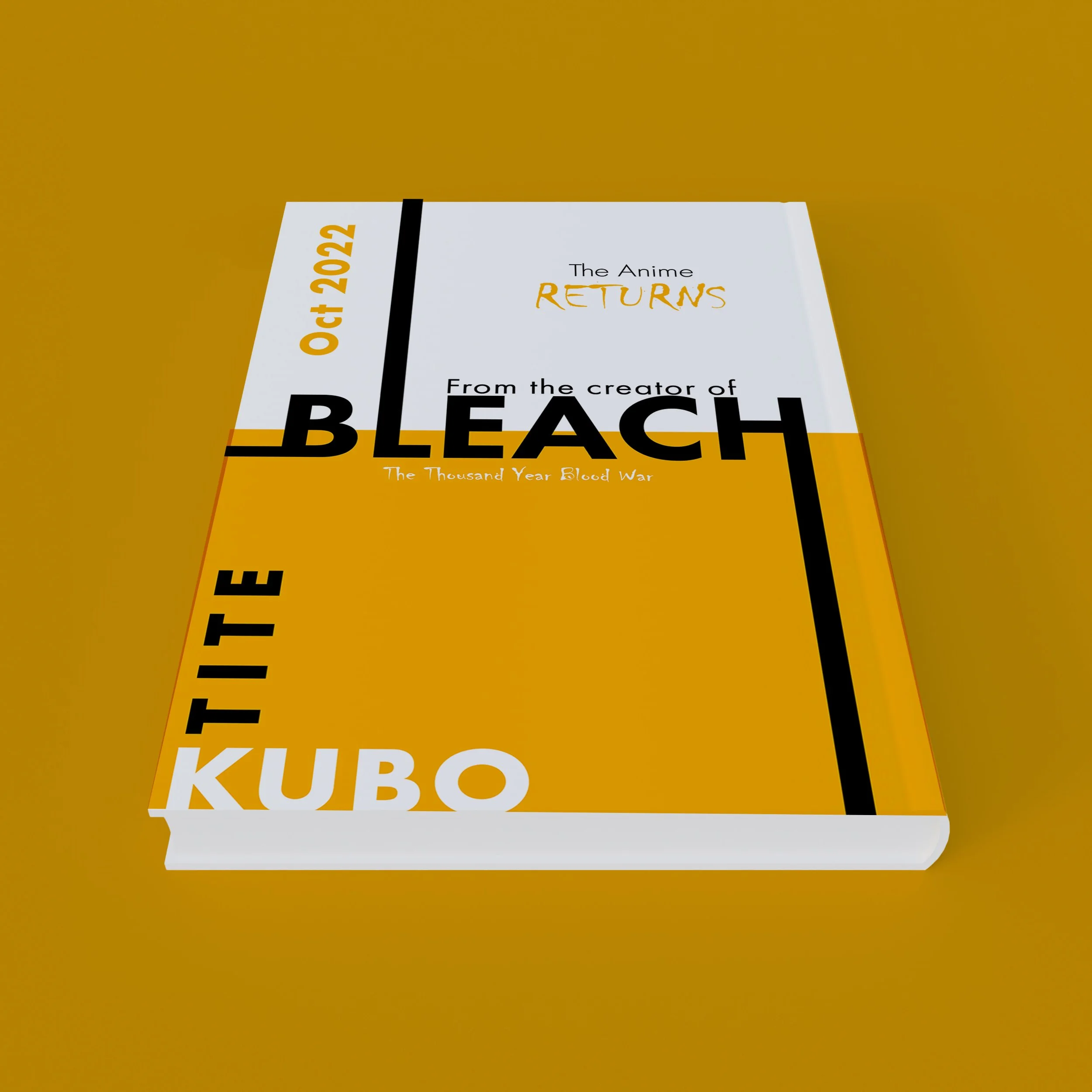
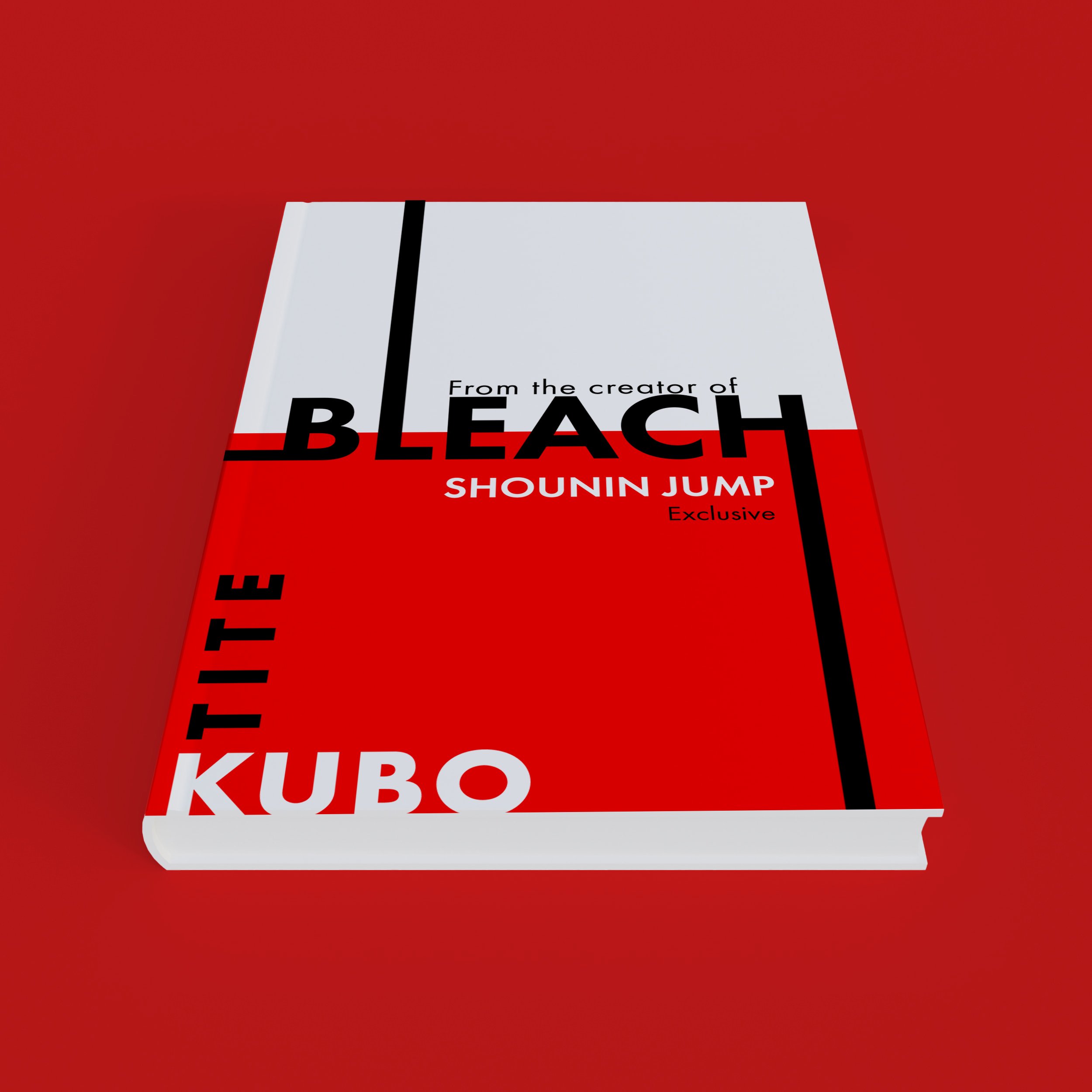
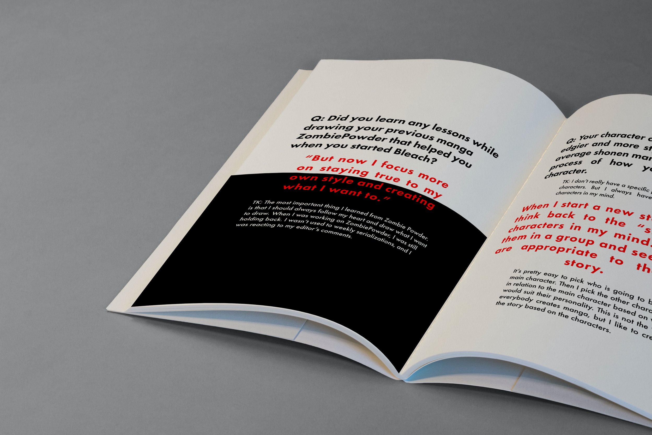
I have taken an interview from Viz Media with the famous mangaka Tite Kubo. The interview discusses the next installment in his manga series, Bleach and I used that as the basis for the text. The series has a heavy emphasis on the idea of contrast between black and white as represented within some of the uniforms and creatures in the show. So I used that as a basis for the overall layout and design. The different colored text has a variety of different meanings from it’s association with particular characters or prominent colors within the show such as the red for the first portion of the show while the orange is for the continuation.
Background